A Cooler Look at Colour

People who don’t know each other very well hardly ever talk about colour. It has an odd reputation for being personal. People say they “like” one colour or another, but after that there’s rarely any more to be said (or thought) about it. There’s no “right” way to see it.
The whole syndrome — the confusion with “personal,” the conviction that it’s impossible or misleading or frivolous to to talk or think about something perfectly familiar, is pretty clear evidence that people perceive colour aesthetically. That may be redundant, like saying people perceive colour using their perception. The point, in any case, is that there are as many ways to perceive colour as there are colours. It’s infinite. Still, there is common ground — our words for colour — in every language — is a kind of evidence.
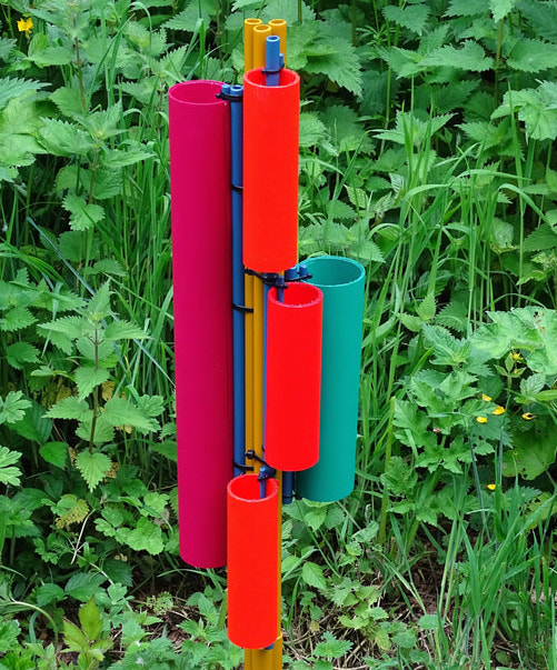
Michael Whetman’s work is sculpture, by some definitions. And yet the word “sculpture” lands in “art,” and almost inevitably back in the assumption that we’re talking about about emotions. We aren’t. Whetman builds light-weight constructions of man-made materials. They are made to be seen outdoors. This being England, outdoors is overwhelmingly green — the colours on the constructions are markedly different. Whetman’s work is perceptible as a fairly effective antidote to colour as emotion. We can start from the awareness that any one viewer will see the work in a unique way. It’s an invitation to literally see for onesself, to look carefully and slowly, move around, notice what changes, and remember.
The image is of one of Michael Whetman’s Colour Constructions (www.michaelwhetman.com).


